The Challenge
Distractions make it hard to maintain momentum. Pomora pairs structured focus/break cycles with subtle cues and analytics, so staying focused feels natural not forceful.
Core Features
01 //
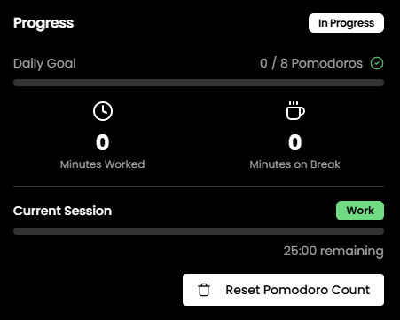
Intuitive Timer
Circular progress with color psychology.
02 //
Analytics
Visual productivity data tracking.
03 //
Tasks
Integrated to-do list for flow.
04 //
Sync
Seamless cross-device experience.


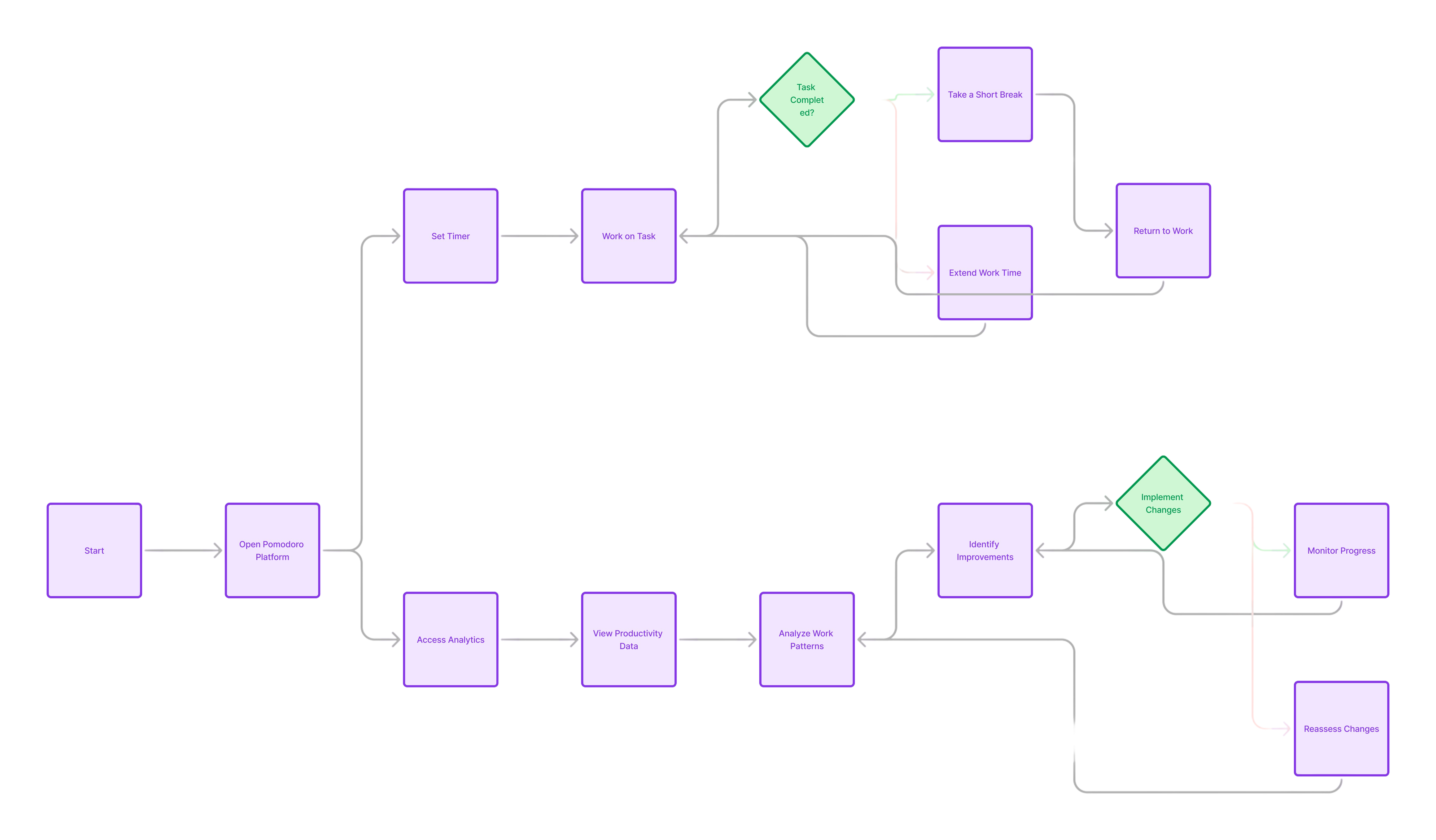
Process & Architecture
Phase 01
Research & Scope
- Analyzed competitor productivity tools
- Defined core focus-cycle requirements
- Prioritized essential MVPs vs nice-to-haves
Phase 02
Design System
- Low-fidelity user flow wireframing
- Accessible, cohesive color palette derivation
- Establishing geometric typographic hierarchy
Phase 03
Performance & Build
- Optimized time-to-interactive
- Smooth 60fps timer interactions
- Rigorous CI/CD deployment pipelines
Tech Stack
Impact
Pomora helps users build consistent focus habits and recover from context switching faster. The combination of clear visual states, smart defaults, and a supportive community loop makes the experience feel calm while still driving progress.
Next Steps
Currently rolling out new features including enhanced analytics and social accountability modes. Stay tuned for updates.